I realized that I didn´t post a painting process here in a while. Actually I have utilized
tumblr as sketchbook for insights in my process, but sometimes it is better to show a process coherent as a whole. This isn´t a tutorial, but I try to explain as much as possible and if you have questions to any of the steps below, I´d be glad to answer them!
One very recent character-driven cover artwork I did was for
Kyle Stiff and his
Heavy Metal Thunder book. It is kind of a different story, because it is a
'choose your own adventure' styled book, but... you better read on Amazon what this genre or better said; the book is all about.
The title as also the description he gave me was all directing towards heavy metal, but mostly targeted at the physical representation.
The main character "
Cromulus" is a mix of El Topo and Rasputin type of persona and a soldier, nicely packaged in a black-armor, equipped with pretty archaic weaponry and a jetpack on his lonesome journey through outer space.
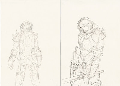 |
| 1.) Character / armor concept |
1.) The first rough draft was merely a concept sketch, an approach to find out in which direction I should go with the armor, weaponry and especially the jetpack design.
 |
| 2.) Stance and jetpack studies |
2.) The stance above is based on the idea that
the cover should reflect the jetpack as much of a burden as it is a display of power. The sword and the gun are placed in a position that allows the eyes to flow into the image from the lower left corner, leading towards the title, back to the character and author name.
 |
| 3.) Crop and sketch based on given specs. |
 |
| 3.1.) Eye-flow-plan |
3.) The sketch I have done on pencil and paper was scanned into Photoshop. I used the polygon-lasso to select just the figure and placed it above a digitally sketched background. The aspect ratio used is a 6x8 format, which is quite good for later use as e-book which is around 600x800px, so that there is plenty of space above the character for typo. The idea that developed in this stage was, that he stands in front of a wall and on the left there is still space that shows the interior of a ruin / uninhabited spaceship.
3.1.) This is an Eye-flow-map (
more info here), it is possible to engage a specific eye-flow with lines, contrasts and various other composition techniques, no one can guarantee that it works as intended, but it is always good to have a plan, instead of hoping the best for a good outcome.
 |
| 4.) Scene sketch with typo |
 |
| 4.1.) Further developed scene with typo |
4.-4.1) To see if there is enough space, I added the typo as a "mock-up" at this point, because now it is still possible to change anything. To get a better impression of the weight the font has and the image, I added some shading and contrast to the painting. Right now there are some flaws that show up, which were not that visible before, such as the head size and the stance which looks more burden than powerful and his right arm that looks too short.
 |
| 5.) roughly colored version |
5.) In this stage, his right arm still looks weird,
but now it haz color! I changed the stance and added a complete layer-group to add colors and some lighting effects. Custom-brushes were used at the bottom, lighting on the character was essential to show the coldness of outer space on the one side and some mysterious blood red on the right side. From a technical point of view; there is a color-layer-group behind the character for the background only, since I have separated the character from the background (like mentioned before). There is also another group of colors on top of the character, in step 5.) it consists only of lighting with red and blue (Check 7.1.) for the layer palette how this actually looks).
 |
| 6.) This colored sketch shows the refinement as a whole |
 |
| 6.1.) This map shows the hot spots where the most work went into |
6.-6.1.) These two images show where the most work went to refine the whole painting. We are getting closer but still: "
way to go".
 |
| 7.) This step shows my workspace which is a bit bigger than the actual image |
 |
| 7.1.) Cluttered layers in uncluttered groups |
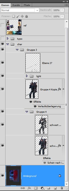
7.) This step shows a bit more of my workspace area, which is actually bigger than the image itself,
for mixing colors, brush tests and temporary reference image placement. I always keep the character separated from the background, until the image is 90% done. So at this stage I have made a duplication of the character layer and made it about 20% darker, then I erased the parts that should stay brighter, to add depth and more contrast to the lighting, this is visible if you compare the version 8.) with 6.) .
7.1.) This shows my layer palette at this point, still a bit messy, I´m used to reduce layer groups, once they´re approved. To keep safety while working back and forth, I save different versions every now and then, so I can import a layer group from a previous version to go back if necessary.
 |
| 8.) Added detail and color adjustments |
8.) This piece shows the almost finished artwork, it is clear where the main work went; the face expression as also the details in background and the lighting from the sides, plus a vignette layer to change focus to the upper half of the work. But still, there are sime minor things that separates this from being a final work.
 |
| 9.) Added fog, frozen blood and depth-of-field... |
 |
| 9.1.) Close up #1 |
 |
| 9.1.) Close up #2 |
 |
| 9.1.) Close up #3 |
 |
| 9.1.) Close up #4 |
9.) Fog, frozen blood on the sword and depth of field to the background add the drama I was going for, another fancy effect are the various lights that are visible on the armor and jetpack, the i-tip is the black smoke on the gun, which is only visible in the version without typo.
9.1.) These are some close-up´s, pretty self-explanatory:)
 |
| 10.) Final version of the cover art with typo |
10.) This is the final version with typo, it shows that the font, bolt and the limited typo effects go well with the sci-fi theme.
I hope you liked this digital painting walk-through, check out the others
here and
here too.
Comments are always welcome.


nice
ReplyDelete