them the exposure with some walk-through or process descriptions here, they deserve.

With the most recent work I´d like to change that and like to
begin a recurring series with cover artworks, that were challenging to me in retrospect, the one or the other way.
When i was asked by J.S.Chancellor to do the cover for her novel, part one of a trilogy, she was gladly open to what should be on the cover.
Usually strict briefings were given or a direction is evident.
This project was in itself notable because of the freedom to co-determine the direction of the art.
Even if this sounds like a dream of creative expression, it is a demanding efford to find out what is important, how can it be incorporated and put into one striking piece that will make it through.
As illustrator you need to be the designer, marketing expert, artist, psychologist, salesman and history-teacher all in one person.
The designer need to be aware of the layout and "corporate identity" of the publishers, the artist -part lets things happen, the psychologist for the unconscious and symbolism, etc...
First there was a big empty canvas in front of me even with the detailed info´s about the book´s story.
But some information helped to direct me very good, I list them below to help Authors to provide any Illustrator the useful information:
- providing reference images of artwork that quite good reflects a "to go for" style
- having a look at my gallery and tell which of the different styles are the preferred ones
- writing up keywords which describe a mood, character, correlation to other characters, etc.
- leaving artistic freedom / creative space for ideas and concepts
- Being aware that "less is more" in book publishing, even if a scene screams for a sophisticated outcome, colors, symbolism and faces tell more than a high detailed scene
- Think about various other use and merchandise in advance to increase possibilities

The first rough draft is considered scrap to most artists, but its also the initial part of the beginning magic.
At this stage proportions and expression are not as important than to put in the creative thoughts which set the boundaries for the further work, like design ideas, composition, focus, etc...
I leave it as rough and open for ideas as possible.
The sword then became a more intriguing part than i actually thought so I developed it in a separate sketch (above right)
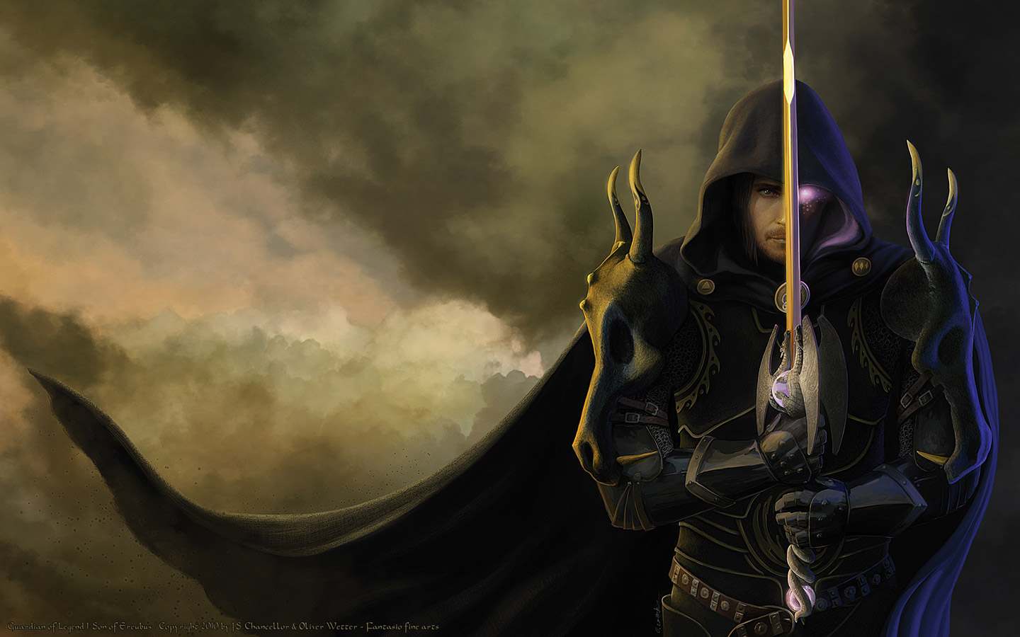
 The detailed pencil sketch indicates that I successfully co-determined the idea to give the main character of book one "Garren" the spotlight on the cover.
What I did not knew, but was a happy accident, is that the sword (and the character itself) has a special role in wandering between light and darkness.
So this pose and idea of the "dividing sword" is essential to the content -double win!
The resulting sketch did not reflect the reference at this time, but was influenced by the following approach.
The shoulder dragon armor were another difficult but yet important detail to me, so I did an NSP-clay -model of both, the sword and the dragons skull:

And its a difference if you do something and feel it with your own hands or just work on it in a virtual environment.
3-dimensional things are meant to be felt, there´s nothing like it.
References are important, regardless if you paint from life or from photography, the important part is always to put the things we seize into question.
Never accept things for what they are, put work and imagination into it to get a better artist, always.
 The following is a quick coloration of the sketch with the approach to set a background mood.
My idea was to chose the sky as a background. Not only because its my favorite background, its possible to express good and bad, dark and light, in nearly every thinkable way.
Timeless, mystical, and always fitting to any desired mood.
The coloring was too hard so I decided to get more muted tones for the sky in the final WIP piece.
The pastel-palette was the best way to go, this way it would not distract from the character too much.
In the "progress" I used to incorporate the references for composition purposes, but the final version shows that there was a lot work that went into the painting to get a believable character.

The overall process raises the question how the "wrap around" part for the cover should look like.
My initial response was to just extend the sky around the whole book, which adds space for the layout, blurb and usual info required, by giving this space and keeping the mood from the front cover.
I´m glad this idea makes it into the final, because this way a wonderful "wallpaper" is developed besides, which is another interesting promotional giveaway option to think about for every serious Author.
The link to the larger resolution Wallpaper will be available soon on J.S.Chancellor´s website and on my deviantArt page. Until that feel free to have a look or download this laptop sized 1440x900 version below.
I´m currently working on a "brush tutorial" for digital painting, so stay tuned or subscribe if this sounds interesting.


0 comments:
Post a Comment